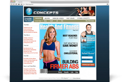
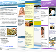
5 design mistakes that may be costing you thousands on your Websites and Craigslist Ads
Posted by Steve Hochman on Mon. Aug. 3rd, 2009

My brother David has been helping dozens of fitness professionals get hundreds of boot camp members with his CraigsList Dominator.
But Im gonna let you on on a little secret...
He's such a powerhouse because of his evil marketing design genius girlfriend.
Her name is Lou, and I talked her into spilling the beans on her marketing design secrets.
So without further ado...
Here is Lou and her killer marketing design tips.
Enjoy -
Unfortunately, design is often overlooked when it comes to CL ads and websites. You can have the best copy in the world, but if it isn't designed for your target audience, they're not going to spend a second reading it. Here are 5 simple design tips you can apply to your CL ads or website and dramatically increase your profit.
1. No Design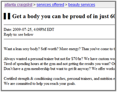
Just like good sales copy, design is what makes people buy things. It's what makes them decide, within seconds, whether or not they can trust you and your business. We've all looked through Google and came across a website that made us hit the back button before reading a single word, and never give it another thought again. Same goes for CL ads.
If you've looked through Craigslist at least once, there's no way you haven't seen them - "paragraph" ads with the same font/color/size. It takes SO much effort to read an ad like that - it's almost like reading a book. That's why most people don't even bother. Let me put it this way: people appreciate when you make an effort to make things easy for them. They show their appreciation by reading your ad and giving you a chance.
2. No Visual Hierarchy
Which brings me to some practical things you can do to make sure someone clicking through CL ads becomes a potential client. One of those things is visual hierarchy. In the design world, Visual Hierarchy is a fancy way of saying that you should be able to see a difference between the more important things and less important things.
So, a headline, for example, should be the biggest thing on the ad. The sub-headline should be smaller, and the paragraph text should be even smaller. Along with size, color is another way to show your readers what is more and less important.
Here's a simple example of good visual hierarchy:

The reason it's so easy to read the text above is because the headline, subhead, and paragraph text don't compete for your attention, so your eye can naturally flow through them.
Here's an example of bad visual hierarchy:

There's so much going on, you get a headache the second you open it. How is anyone supposed to have ANY idea where to look or what to read first???
3. Less is more
Which brings me to another sound piece of advice: if it doesn't serve a purpose - don't use it. Browsing through CL, I've seen so many fitness ads decorated with a variety of unnecessary and distracting symbols. Things like yellow stars, random colored shapes, etc. etc. etc.
Don't be afraid of space. Space is your friend. Having enough spaces between blocks of text or pictures is what helps guide the reader's eye through the ad. On the other hand, having tons of unnecessary graphics will not only turn off hundreds of potential clients, it will also make you seem really unprofessional.
4. Never put text over a background image
Unless, of course, the background image is abstract enough where it doesn't make the text hard to read. It surprises me how many people still do this:

PLEASE don't write your testimonials on the client's picture or on an enlarged version of your logo. It is impossible to read text on top of a clear image. Cut the Craigslist readers some slack and give their eyes a break.
5. Don't design for yourself
This is one of the biggest design mistakes, since you're not advertising to yourself. Let's compare an ad or website to fishing. If you like cheesecake, and you go fishing, you're not going to put cheesecake on the hook to catch fish. You'll put what they like! Do the same with design. Think of your ideal customers and what appeals to them. What colors they like, what kind of pictures they'll like...these things are crucial in getting them hooked!
If you're a man advertising for a women's boot camp, forget for a moment that you may like bright reds, blacks, and browns. Think of what women like - more gentle, less aggressive colors - and you'll be shocked at how many more calls you'll be getting, and how much more money you'll be making.
As a woman, I would never call this place:

But I am a member of this place:

To summarize: 
You may have the most amazing product in the world. You may be the most enthusiastic trainer with the most pimped out gym. But it comes down to this: when someone clicks on your ad or website it takes 3 seconds - that's it! - 3 seconds for them to get a first impression. How you use those 3 seconds will determine your relationship with that person, so use them wisely!
You can learn more about Lou and my bro david's kick but web design and CRAIGSLIST DOMINATOR by contacting them HERE
Be sure to let Lou know what you though of her KILLER tips.
Posted in Blog by |
